

Abstract by Design
There’s a quiet tension that lives at the center of my work: the structure of academia and the instinct of abstraction. Studying graphic design in an academic environment didn’t dilute my abstract expressionist tendencies—it sharpened them. It gave them edges to push against.
In school, design is often treated like a system of rules before it is treated like a language. Grid structures, hierarchy, alignment, kerning, composition—these weren’t just suggestions; they were frameworks drilled into repetition until they became second nature. At first, that felt like containment. My instinct has always leaned toward the emotional, the gestural, the unplanned. I was drawn to texture over precision, rupture over balance, intuition over instruction.
But over time, something unexpected happened: the structure stopped feeling like a cage and started behaving like a pressure system.
Learning graphic design academically forced me to understand why certain visual decisions “work.” Not just aesthetically, but psychologically and functionally. I learned how attention moves across a page, how spacing can create silence, how hierarchy can manipulate urgency. This knowledge didn’t replace my abstract tendencies—it gave them a new kind of intelligence.
My abstract expressionist style didn’t emerge in spite of academia; it emerged through friction with it.
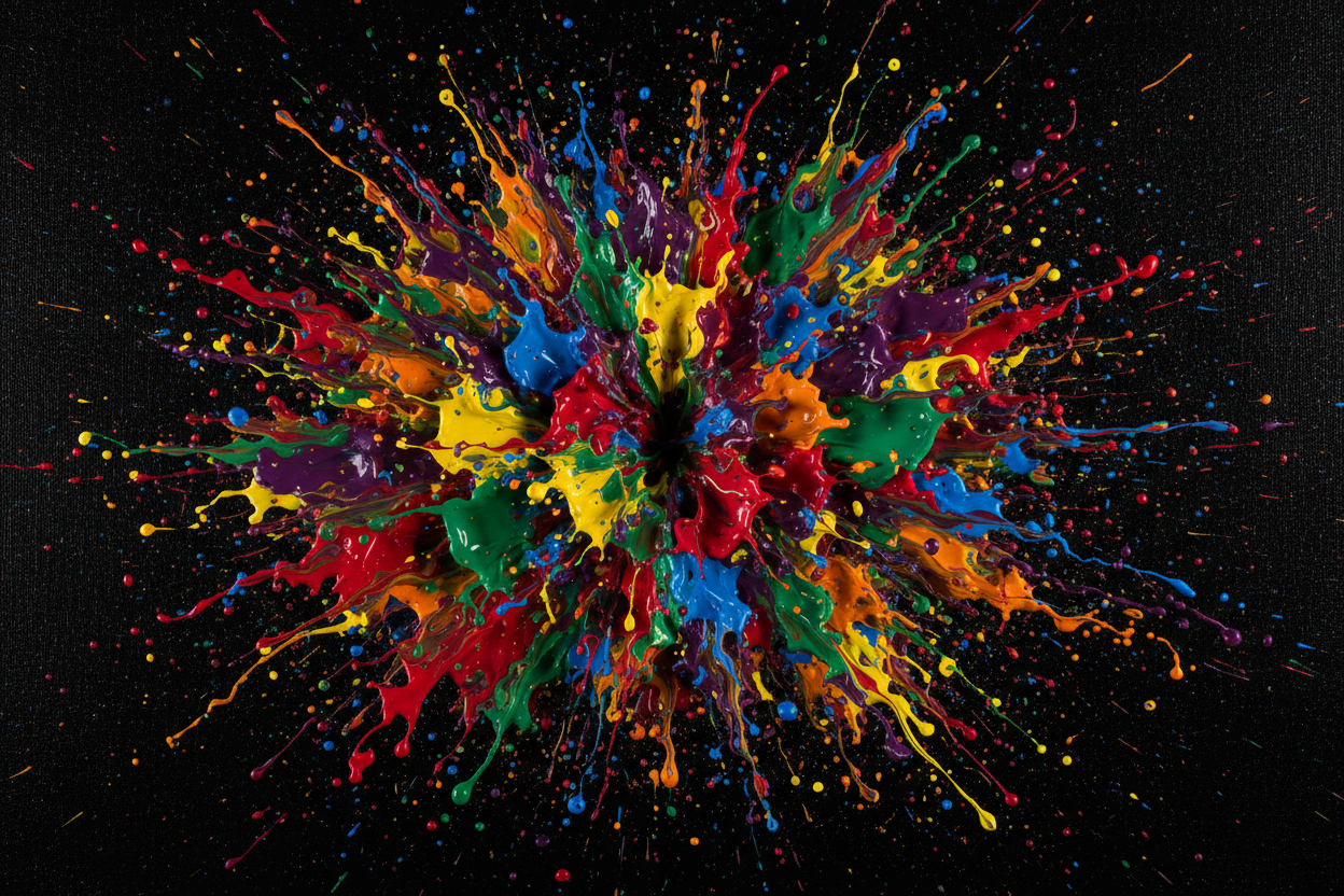
Where academic design demanded clarity, my personal work began to explore ambiguity. Where the classroom insisted on legibility, my practice leaned into disruption. I started breaking grids I had just learned to construct. I began treating typography less like communication and more like material. Letters stopped being carriers of meaning and became shapes, weight, rhythm, noise.
In many ways, abstraction became my way of “undoing” what I was taught—but in an informed way. I wasn’t rejecting structure blindly; I was dismantling it with understanding. That distinction matters. There’s a difference between chaos and intentional rupture. Academia gave me the tools to recognize that difference in my own hand.
Color theory, too, shifted in meaning. In class, color is often functional: contrast ratios, readability, brand systems. In my personal work, color became emotional architecture. A muted palette wasn’t just a design choice—it was a psychological temperature. A harsh clash wasn’t an error—it was tension made visible. I began to think less like a designer solving a problem and more like a painter constructing a feeling.
What emerged was a hybrid language: part system, part instinct.
Even now, I can feel both voices in my process. One voice asks, “Is this balanced? Is this resolved? Does it communicate clearly?” The other asks, “Does this feel alive? Does it resist certainty? Does it breathe?” My work exists in the negotiation between those questions.
If academia gave me anything, it’s discipline—but more importantly, it gave me awareness. I know the rules well enough to break them with intention. I understand the grid well enough to let it collapse meaningfully. And I understand that abstraction isn’t the absence of structure—it’s what happens when structure is stretched until it becomes emotional.
My practice continues to sit in that space of tension. Not choosing between order and expression, but letting them interrupt each other.